Visual Distinction between
Colour and Shape
a functional explanation
applying camouflage concepts in analysis of colourdesign effects
on experimental relieves
by: Cecilia Häggström
|
This is a simplified
and richly illustrated
brief of a per-reviewed paper
presented at AIC conference in Sydney 2009,
see http://www.aic2009.org/
|
 |
Our seeing
of colour and shape depends on a pre-perceptual recognition of
patterns that allow us to distinct between such colourvariations
that we see as colour and such that we see as shape.
Several independent observations
show that when colourvariation are seen as belonging to
shape, then they also loose colour-character, and reversely:
The colour of a shadow that is seen as an object-colour
may gain distinct hues (Hurvich 1981:42, Häggström
1997 >>, Häggström
2009, Logvinenko 2009).
|
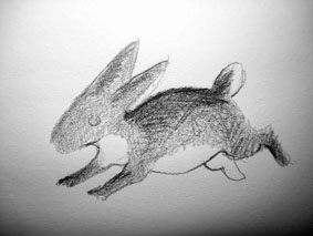
Countershading on a rabbit
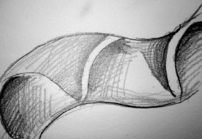
Constructive shading on a snake
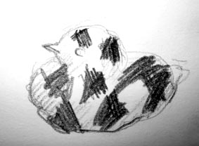
Disruptive pattern on a young bird
|
The explanation that object-colour
patterns may interfere with finer shape defining patterns is
suggested already in 1940, by the biologist H B Cott (1940).
To Cott this is just a minor and commonsense explanation of how
and why some colour patterns can camouflage the visual shape
of a body.
In spite of this assumption's
capacity to grasp essential colour-design effects, the visual
separation is first taken into account in an architectural context
by Häggström (2009).
Three different ways for (object-)
colour patterns to interfere with shapedefining patterns are
identified by Cott (1940) by the camouflage concepts countershading,
constructive shading and disruptive patterns.
|
|
In real life we are visually
handling extreme differences in levels of light and a common
lack in unsuccessful attempts to do realistic or trompe l'eoil
painting is that the artist did not dare to produce such strong
contrasts.
The basic rule is that the pattern
with stronger contrasts is the one defining shape - also when
it really doesn't define a shape at all, but just flat patches
- as in a disruptive camouflage.
*
*
|
|
*
Applying these concepts painting
on geomterical reliefs, one can more readily grasp the relevans
of these concepts for analysis of colour design effects on architectural
visibility.
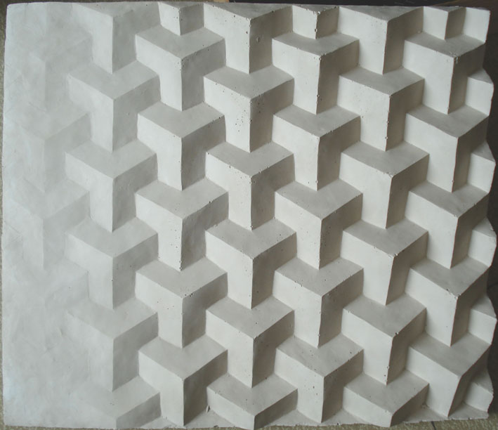
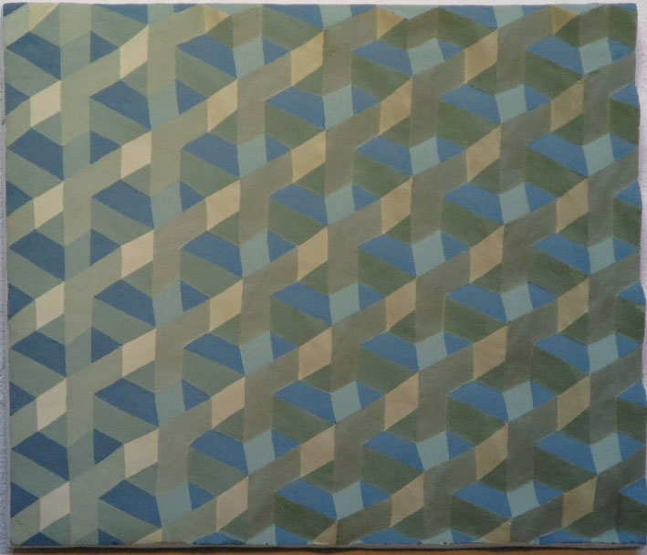
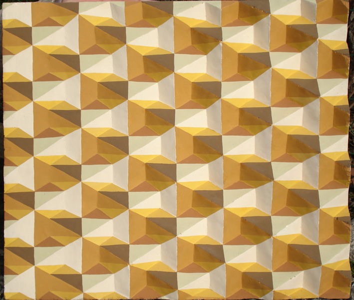
The relief used here is originally
sculptured in clay and design so that the shape is gradually
rising from the flat left side to "full" three-dimensionality
on the right side. Thus it allows direct visual observation of
how colour influences shape, and vice versa.
The clay-original was used to
produce a siliconrubber mould in which all the here shown painted
plaster reliefs are made, so that their actual shape is identical.
Keep this un-painted
plaster relief in mind when viewing the following painted ones
:-).
*
|
 |
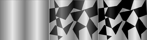
Here a simple
disruptive pattern clearly interfere with the shapedefing pattern
given by the light at that moment. |
*
*
 *
*
|
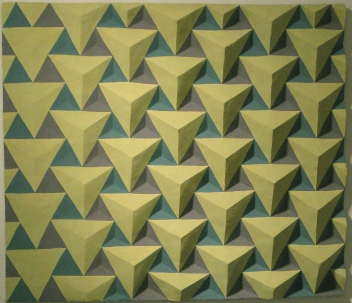
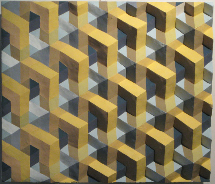
These reliefs (also presented
at Art Now Gallery 2009 >>)
combine in more complex ways disruption, countershading and its
opposite "co-shading" (Häggström 2009) and
constructive shading to change the visual appearence of the same
shape.
On the pages where I present
the exhibition at Art Now Gallery
2009 >> you can also see how the visual shape of some
of these reliefs are changed by different viewing positions.
The completely deforming effects
of the painted patterns are in real life outruled a bit by our
stereoscopic seeing, while we are all lost to the illusion in
the flat picture.
That our stereoscopic seeing
helps us to see through the illusion means that when you are
less than 5-6 meters away from the relief and look at it with
both eyes, then it is possible to detect the real shape.
It is not readily seen though,
and somehow the contradictory information given by the real shape
and the painted pattern creates a visual ambivalence. Even though
you can see the real shape it doesn't look the same as
in the unpainted/neutral relief!
This visual ambivalence creates
something new: it adds subtle aesthetic qualities - like "atmospheres"
- to the factual reality.
|
| |
|
 |
Shapedefining patterns are naturally
decisive not only for seeing the shape of animal bodies or reliefs:
Our seeing of architectural shape may be even more susceptible
to colour patterns interfering with shapedefining patterns, since
most seeing of architectural shape is from a distance of more
than 5-6 meters, and therefor not aided by the stereoscopic information.
From seeing the effects of colourpatterns
interfering with the somewhat abstract shape of these geometrical
reliefs, it is easy to understand the relevance of the three
concepts in an architectural context - both as tools for more
educated planning of colour design and for analysing aesthetic
effects of colour design in existing (new or old) architecture.
|